
Background
Communication has changed dramatically with the invention of the smart phone. Text messaging has become part of normal life and messaging apps, such as WhatsApp, offer convenience and connectivity across the world.
While text messaging is fast and convenient, there are situations where audio is better. For people with disabilities or visual impairments, audio offers more accessibility.
WhatsApp, for example, does not have its own text-to-speech feature. While you can make calls and record audio snippets, it relies on a phone's hands-free features or third-party plugins for text-to-speech. This can be cumbersome to set up which is why there are lots of internet guides on how to do it.
Overview
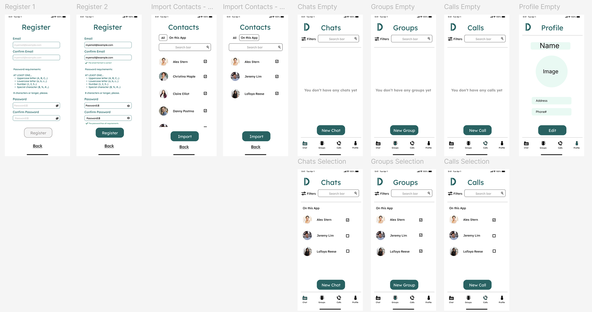
I designed Dialogue to be a more accessible messaging application. With a focus on user accessibility, clarity, and scalable UI systems with a built in text-to-speech feature, Dialogue offers a hypothetical alternative to WhatsApp.
Give the Figma prototype a try below...
The Goal
Design a messaging experience that:
* Improves accessibility through text-to-speech
* Delivers clear, unambiguous UI patterns
* Supports efficient, high-frequency communication workflows
* Establishes a scalable design system foundation
My Role
* Led UI and interaction design
* Defined visual system (typography, color, layout)
* Designed high-fidelity screens and interaction flows
* Built a component-based structure in Figma
* Prototyped key workflows (sign-in, messaging, accessibility interactions)
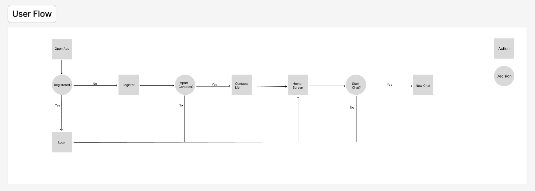
Designing for Clarity
Messaging is a repetitive, high-speed workflow, where clarity and efficiency are critical.
Key UI decisions:
* Reduced icon ambiguity → Paired icons with clear visual affordances and consistent placement
* Strengthened visual hierarchy → Prioritized message content, timestamps, and actions using spacing and typographic scale
* Minimized cognitive load → Simplified layouts to support rapid scanning and interaction
Accessibility as a Core Interaction Layer
A primary innovation in Dialogue is integrated text-to-speech within message flows.
Design considerations:
Seamless activation within the message thread
Non-disruptive integration into existing UI patterns
This ensures accessibility is:
Embedded into the workflow—not treated as a secondary feature
*** Note: the next iteration of this project will contain clear feedback states (active, paused, completed) within message flows.
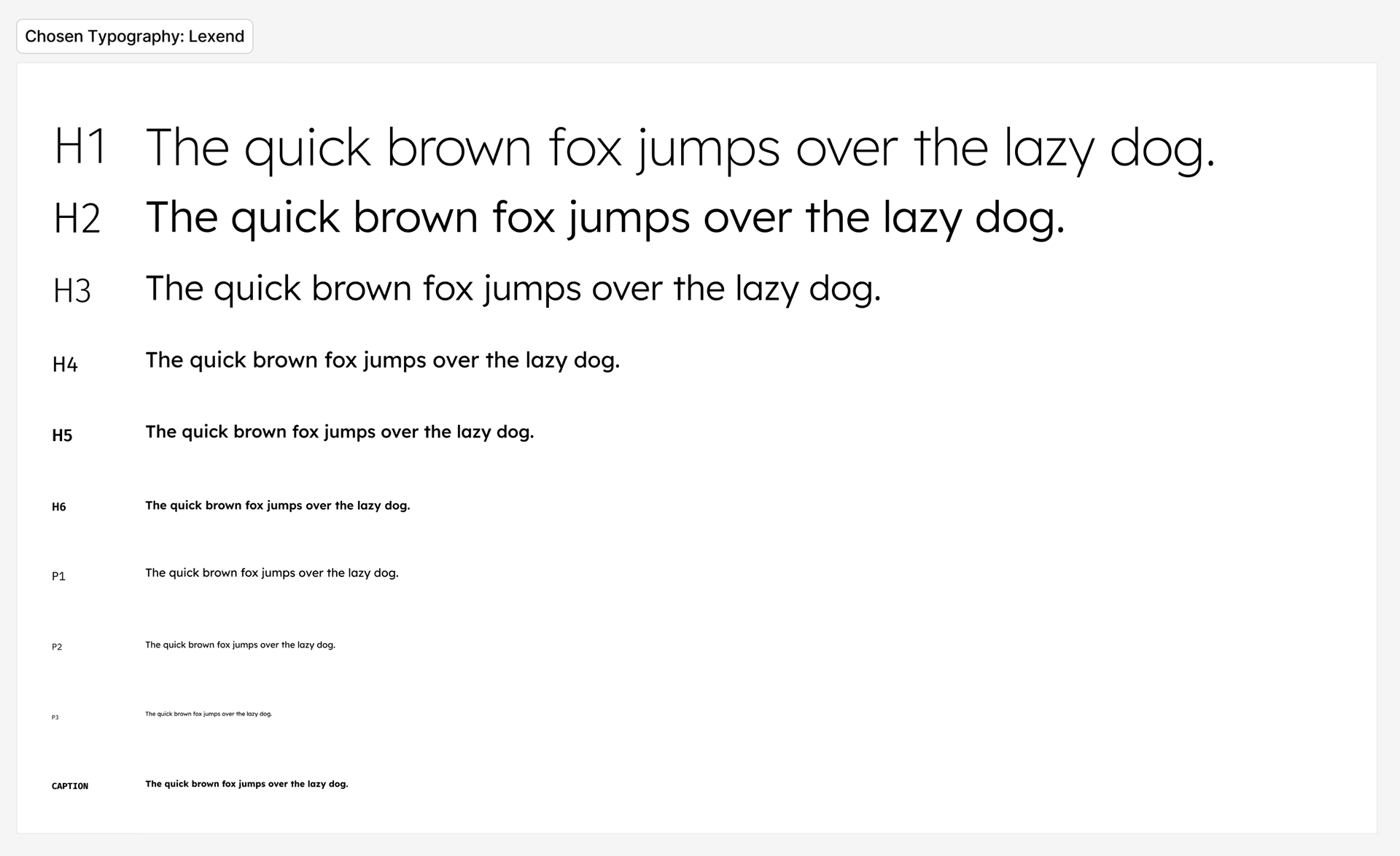
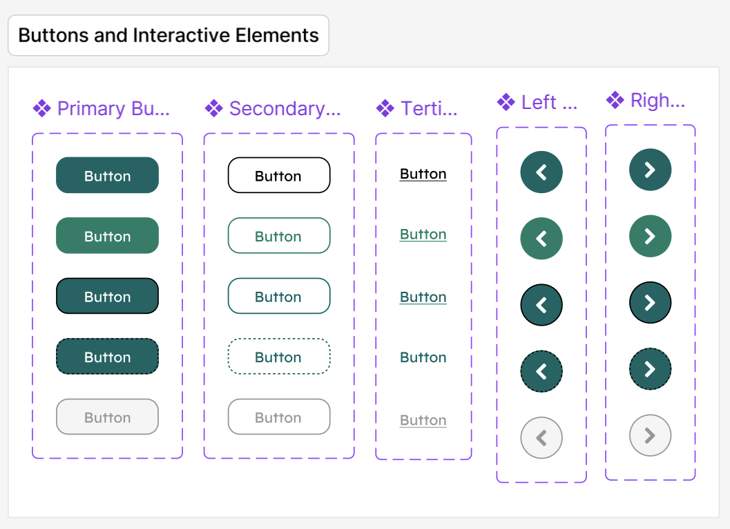
Visual System & UI Foundations
I developed a cohesive visual system to support clarity and scalability.
Typography
Defined hierarchy for:
* Message content
* Metadata (timestamps, status)
* Navigation elements
* Message content
* Metadata (timestamps, status)
* Navigation elements
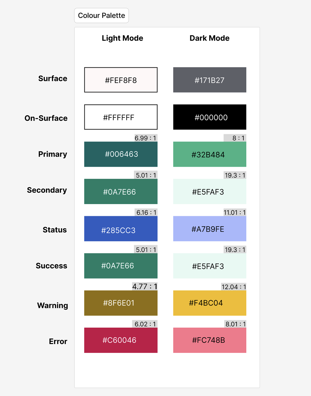
Colour
Built a palette supporting:
* Readability across light mode
* Clear system states (active, disabled, feedback)
* Clear system states (active, disabled, feedback)
Layout
Used consistent spacing and alignment to:
* Improve scanability
* Reinforce structure across screens
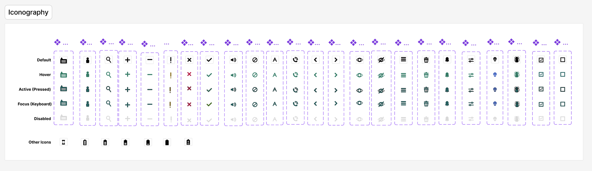
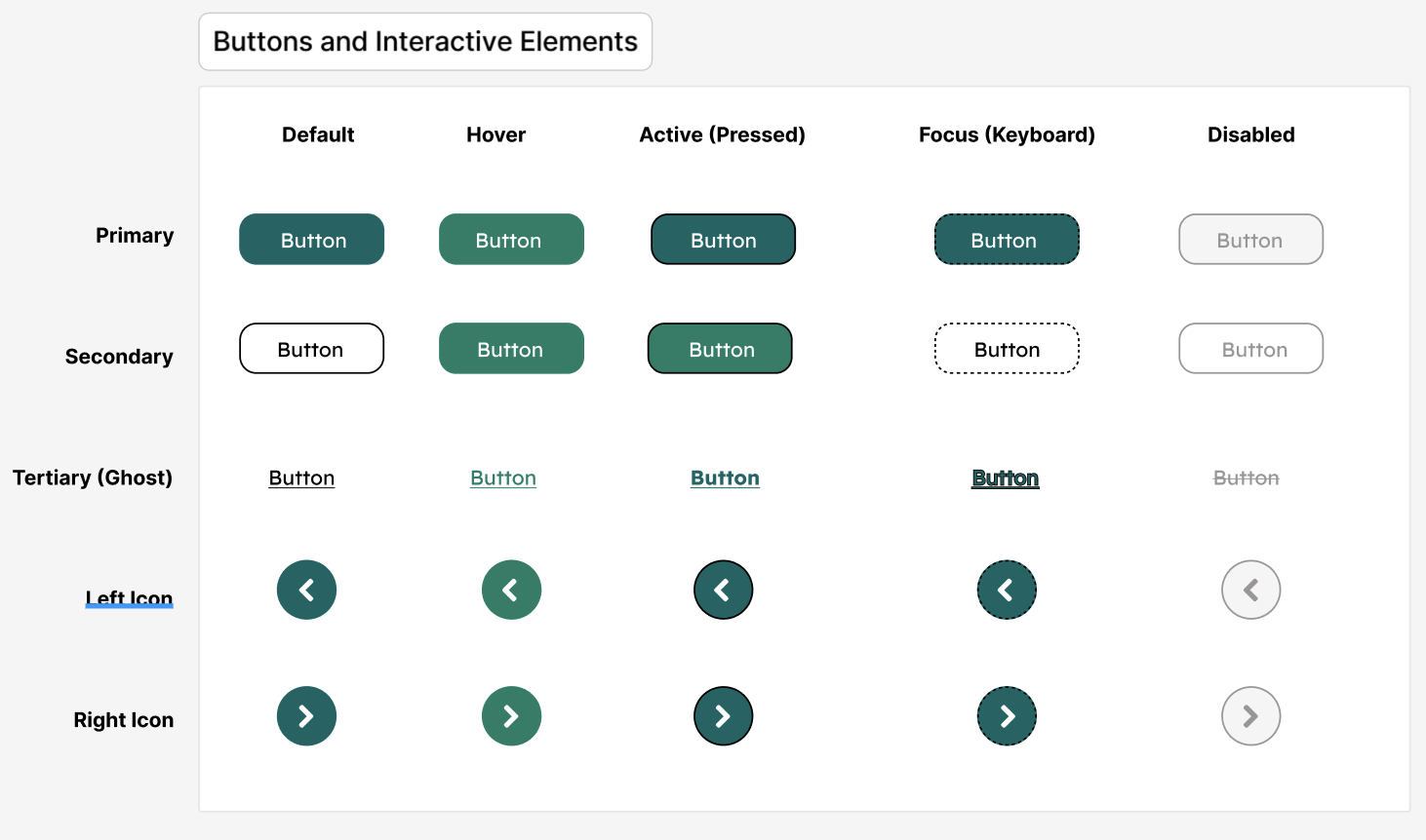
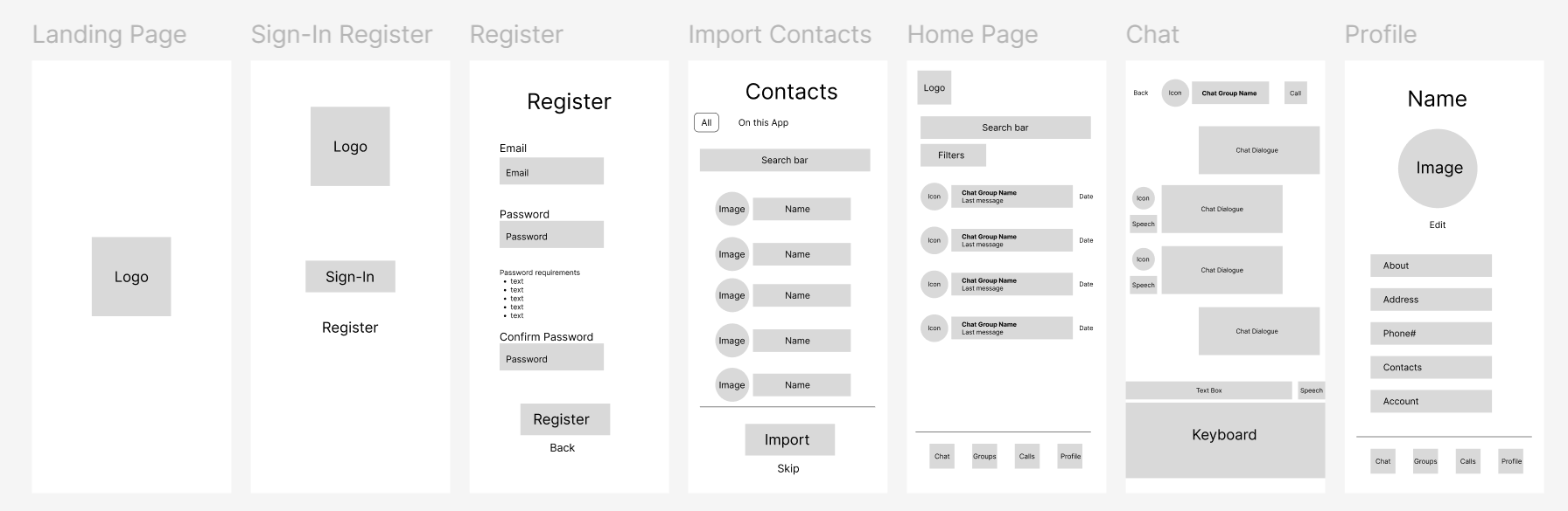
Designing for Scale: Component Thinking
To support consistency and future growth, I structured the UI as a component-based system in Figma.
Key components:
* Message bubbles (sent/received states)
* Input fields and action bars
* Navigation elements
* Accessibility controls (text-to-speech triggers)
Each component was designed to:
* Be reusable across screens
* Support multiple states
* Maintain visual consistency
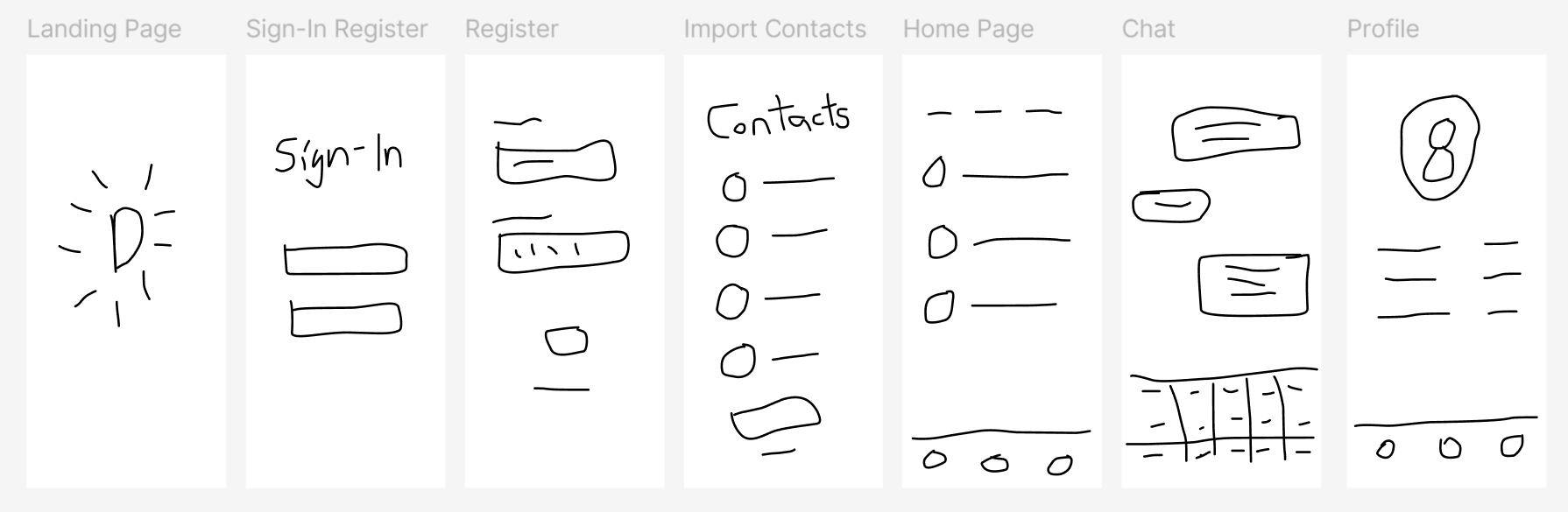
Prototyping Complex Interactions
I developed interactive prototypes to validate:
* Authentication flows (sign-in, registration)
* Core messaging interactions
* Text-to-speech activation within conversations
This allowed for:
* Testing interaction clarity
* Refining transitions and feedback
* Ensuring usability across key workflows
Outcome
The final design delivers:
* A clear, structured messaging interface
* Integrated accessibility features within core workflows
* A foundation for a scalable design system
* Improved usability through visual hierarchy and consistency
Key Takeaways
* Accessibility features are most effective when embedded directly into primary workflows
* Strong visual hierarchy is critical in high-frequency, data-light but interaction-dense environments
* Designing with components early supports scalability and consistency
* Clear, unambiguous UI patterns reduce friction in everyday use